

LIVE NATION
A concept project reimagining the live music experience
We were tasked with establishing user needs and creating a mobile prototype for buying and attending live shows, remotely.
COVID-19 led thousands of artists to cancel live in-person shows and millions of fans without entertainment. And the pandemic left Live Nation, the largest entertainment company of its kind, with a huge challenge. Here's what we came up with.
A bird’s-eye view 👀
Duration
Two-week design sprint
Co-Designers
Jay Kendrick
Breana Panaguiton
Annie Zheng
Tools
Adobe XD, Illustrator, Photoshop, and InDesign
Zoom Video Conferencing
Paste App
VideoAsk
Typeform
Miro
Methods
Heuristic Evaluation
User Surveys (Quantitative)
User Interviews, Usability Testing (Qualitative)
Journey Mapping
Persona, Problem Statement, and “How Might We”
Design Studio
Wireframing, Prototyping
*The entirety of this project (including all of my team’s research and testing) took place remotely.

Users aren’t satisfied with the current alternatives for live music events
🙅🏾♀️
Users were very clear when it came to articulating their past experiences and the ones they want for the future. They loved the social aspect of attending music shows with friends, the spiritual experience of being immersed in the sounds, and the ability to support their favorite artists by shopping their merchandise booths. BUT. The current alternatives to live in-person shows (Think YouTube, Instagram, and Twitch) just aren’t meeting their standards. Users feel disconnected from their friends and, most importantly, the artist’s performance.

“Never gonna be the same as the real thing.”
Yup, that’s a direct quote.
So, How Might We…
Create a more memorable virtual music experience 🧠🤯
for live music go-ers 👩🏽👵🏽🧔👧🏿
to feel the same level of engagement as in-person music events 🤩🎤👨🏽🎤
by developing impactful and unique features that mirror the live experience 🤘💃
so users feel heightened connection to the artist’s performance 👏🏾 🙌

We prioritized features 🚦
We synthesized the data from our initial user testing and research, highlighted the features that would satisfy users' needs, and organized them into a prioritization matrix. This allowed us to hone in on the features that would have the highest impact and could be created within two weeks.
Design studio or bust ✍️
We conducted several rounds of rapid-fire sketching sessions to lay the groundwork for our prototype. We used an iterative approach to fine tune the ideas we liked.


I can see clearly now 🎶
What emerged from our design studio were several concepts that would become our mid-fidelity wireframe.
In this iteration, we built out and tested with users:
Revamped Home & Search Pages
Photo Gallery
Calendar & Events Organizer
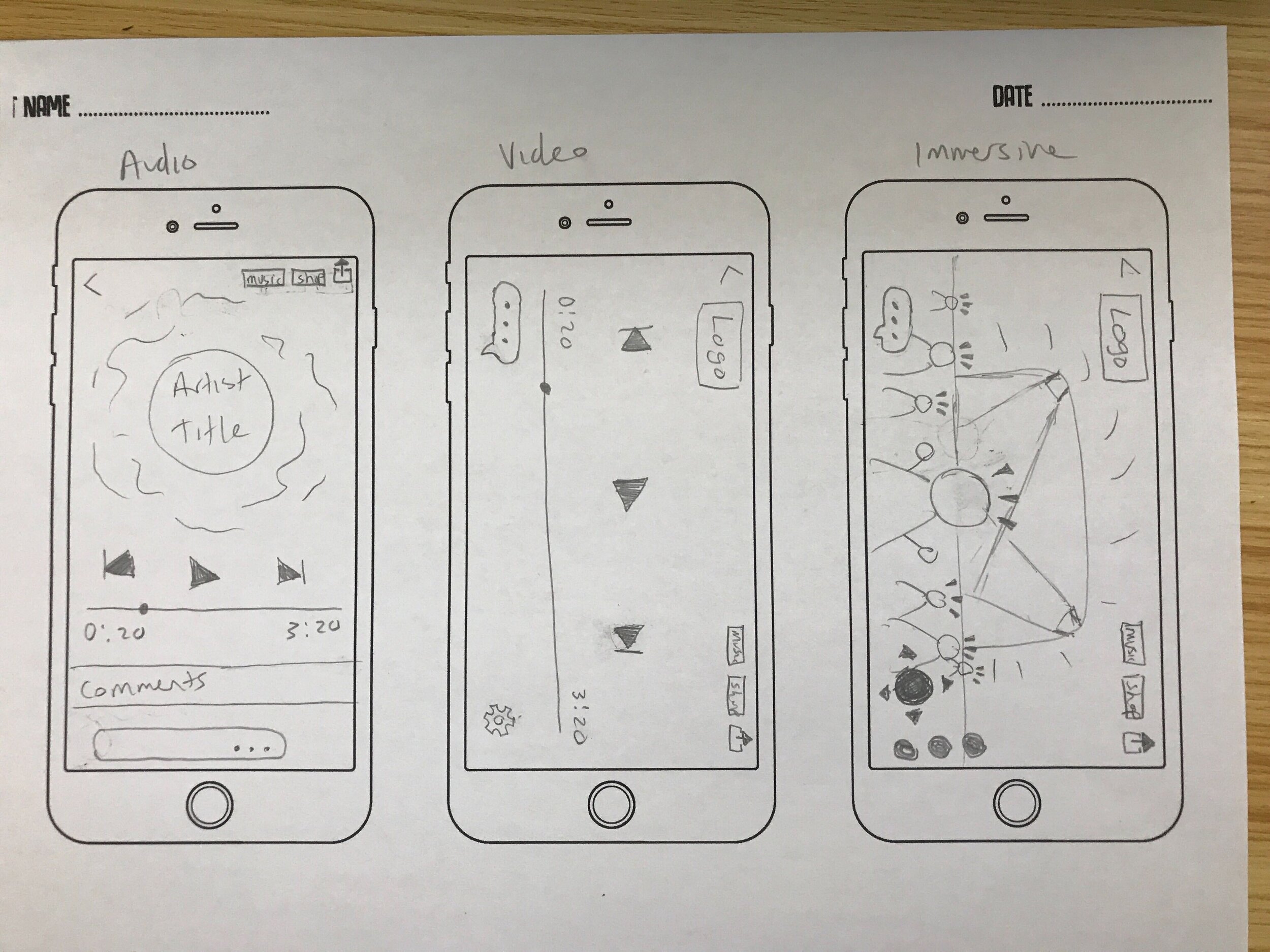
3-Tiered Live Show Experience (Audio Only, Video, & Gamified Immersive)

What we learned from testing 📝
We found overall, users had a really great response to our prototype, but some things needed to be fixed. Users were confused by our tiered show experience. Rather than have the audio-only, video, and fully immersive experiences separate, users thought it made more sense to have them all in one place, and we agreed.
Here’s what else we found out:
Our shop and music tabs needed fine tuning
The gallery was too bare bones
The onboarding tutorial for the immersive was confusing
The Bad 😡: “I thought I would find the Recommended event listings in the Homepage."
We heard this comment several times from users. They found particular sections of our design counterintuitive and hard to navigate.
The Good 😊: "I like that the app gives you the festival experience. It feels like you’re in a crowd."
All 6 users found that a gamified virtual concert helped to heighten their experience! It was more pleasurable than a regular live stream and they enjoyed being able to chat with friends without missing any of the action.

We listened, then iterated
👂
Our second prototype was all about refinement. We hammered down the loose ends and thought critically about the changes our users wanted to see. We built a login and onboarding process to help acclimate users to the app. We made the home page more personalized, added additional capabilities to the gallery, and touched up the immersive experience.
Presentation & Prototype Walk-Through
Skip ahead to 5:48 for the prototype walk-through
Next Steps & Reflection 🤔
Next Steps for my team include:
A Light Mode 💡
Accessible Shop with Artist Branded Merchandise 🛍️
A More Interactive Gallery 🖼️
On-Demand Video Streaming ⏯️
Us as co-collaborators 👩🏽🧔🏾👩🏻
In my eyes, we did a damn good job for the constraints we had. Working collaboratively can be challenging, but we learned early on to play to our strengths as individuals and rely on each other when we were in trouble. We were honest with each other. If something wasn’t working or needed to be changed, we talked about it. If we were feeling bogged down or tired, we negotiated longer breaks and rest time. And most importantly, we set boundaries and were honest with our respective capacities.
We also had the added challenge of working entirely remotely throughout the process. And because my co-collaborators and I were in three different parts of the country, it was sometimes challenging to coordinate schedules.
Me as a teammate 🧔🏾
At the beginning of this project, we developed a manifesto to help guide our process and set goals for ourselves as a team and individually. In that, I noted one of my personal goals was to push myself out of my comfort zone, and I did! I worked diligently with my team and lead parts of the project the old me would squirm at! This was a defining moment for me as a Junior UX Designer, and I feel I accomplished my goals plus some. I’m inspired to continue setting the bar higher for myself while maintaining healthy boundaries and considerations for an optimal work/life balance.